Project Objective
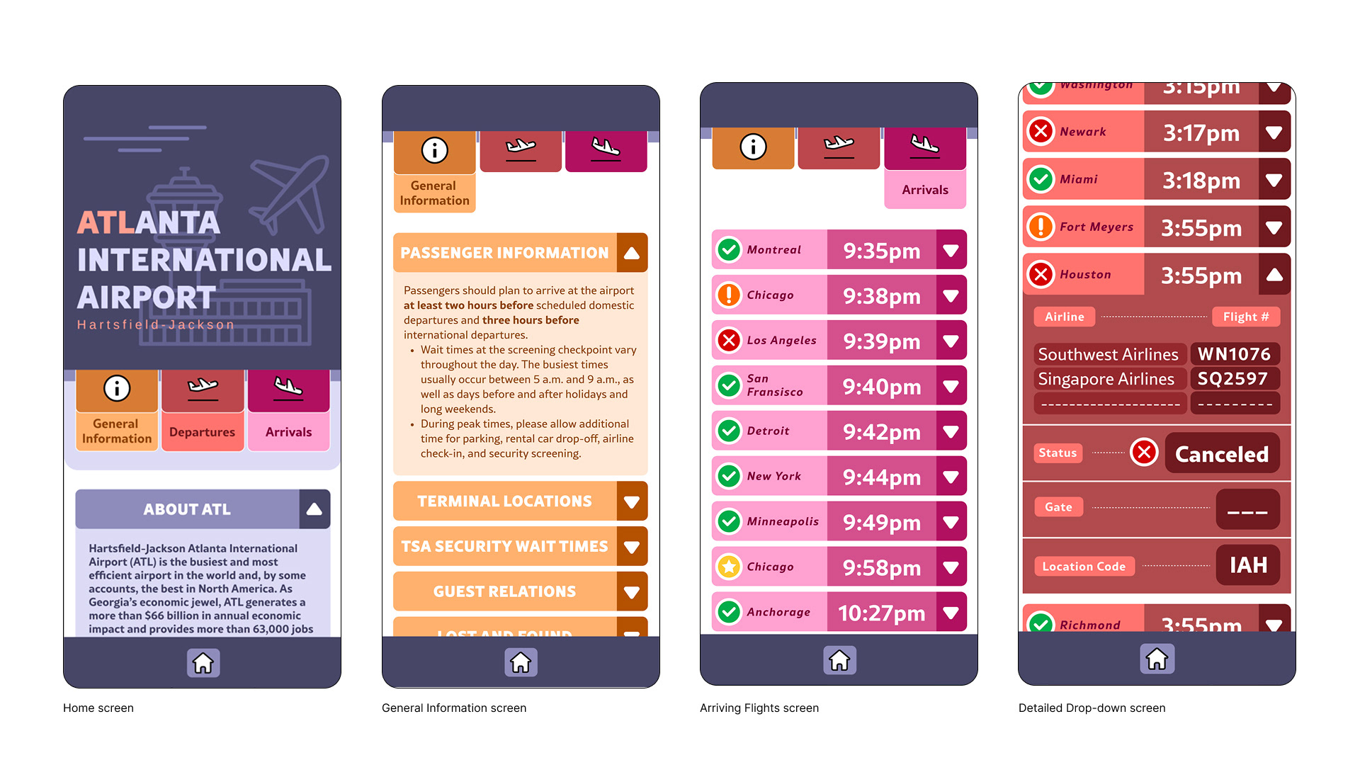
Effectively communicate clear tabular hierarchy, typographic hierarchy, and complex typographic content. I developed a visual/typographic system in the dimensions of an iPhone 16, 393px by 852px.
Ideation
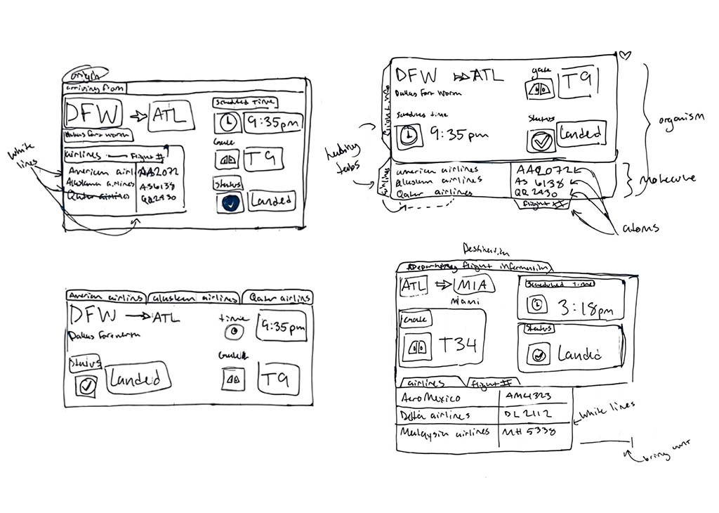
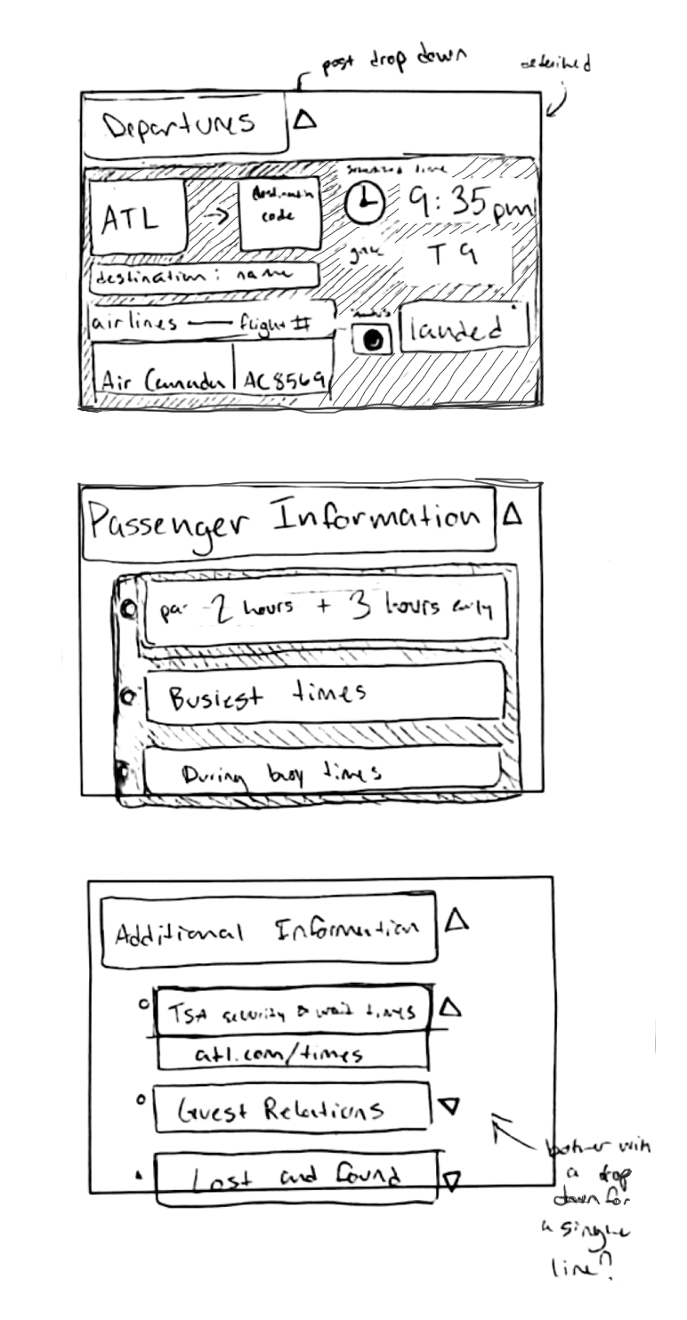
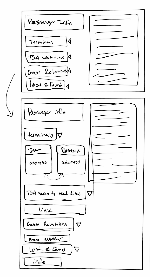
To determine a layout, I initially used quick and loose sketches, informing my ideas of clear format of the content format before moving digital on Figma.
Typeface Selection:
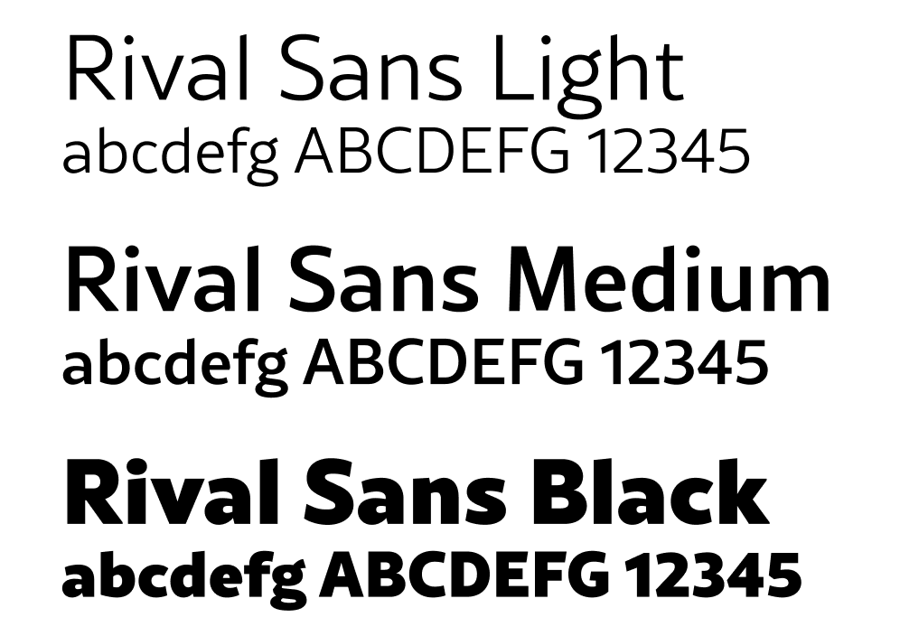
Rival Sans
A typeface designed by Olivier Gourvat, from Mostardesign Type Foundry. I picked it for its approachable, humanist-sans design, and angular cuts on the top of vertical strokes, which reminded me of airplane wings.
Initial Digital Iterations
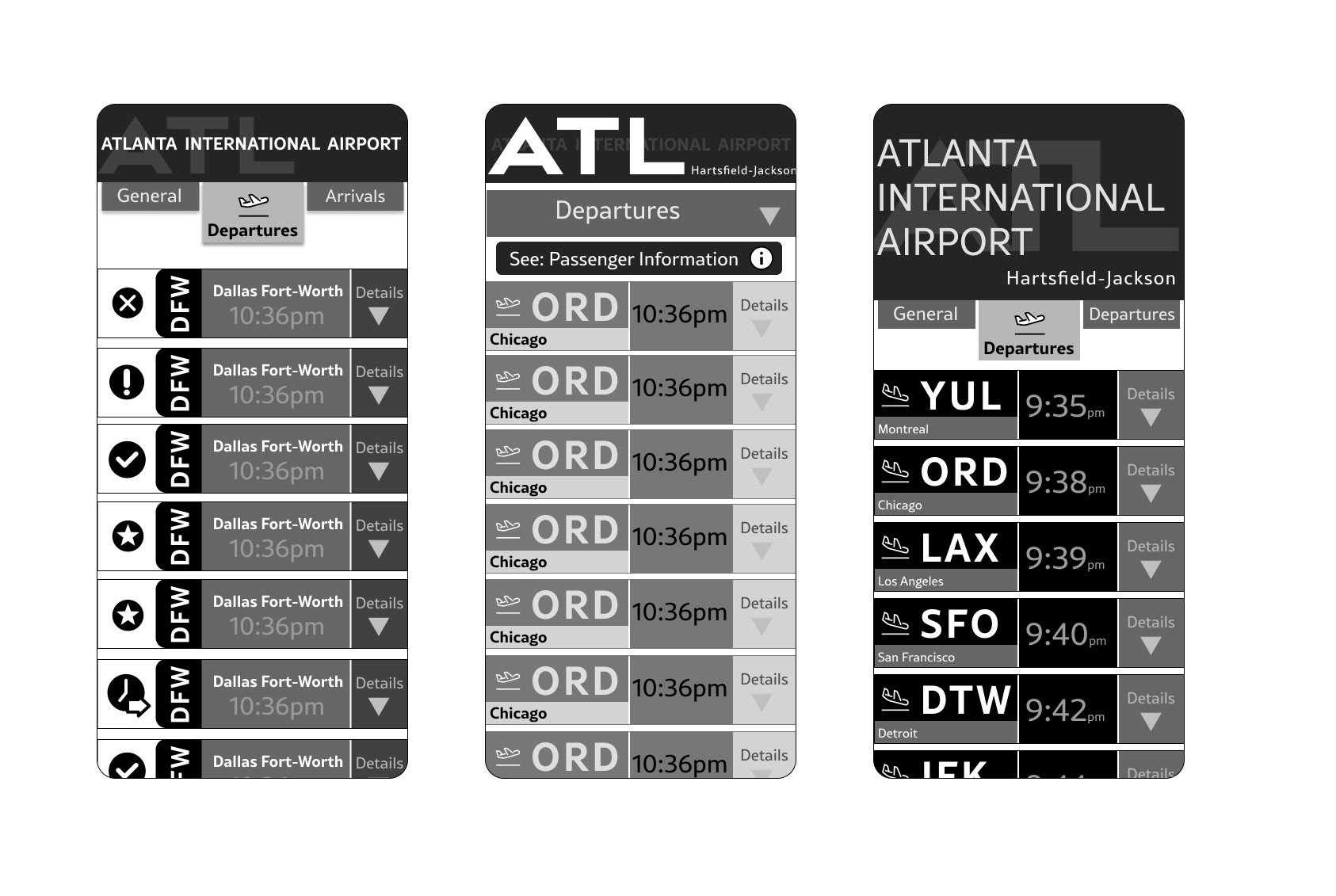
We began our digital iteration in Figma. We began with limited variables in order to focus on base formats that have successful hierarchies.
Class submission
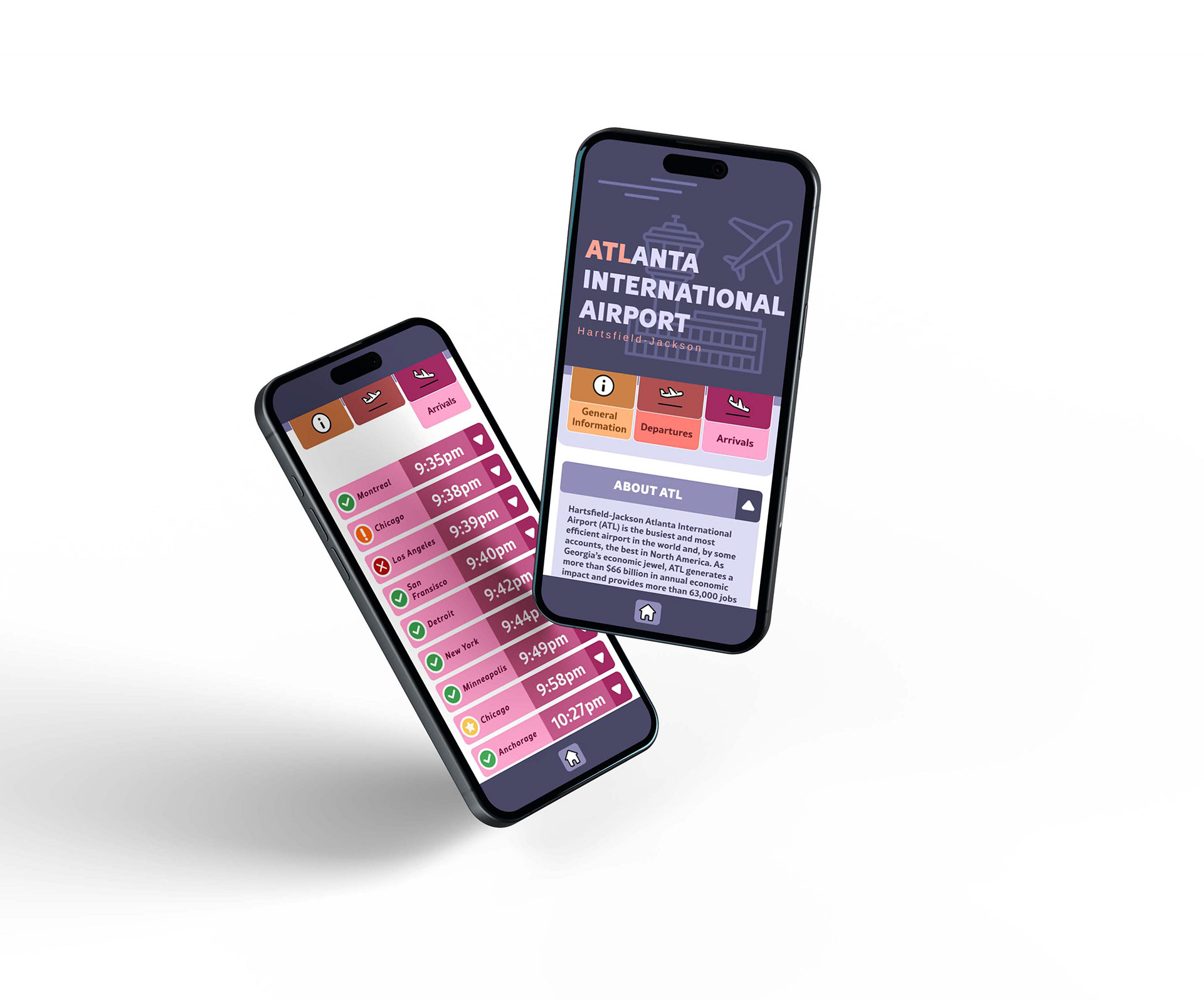
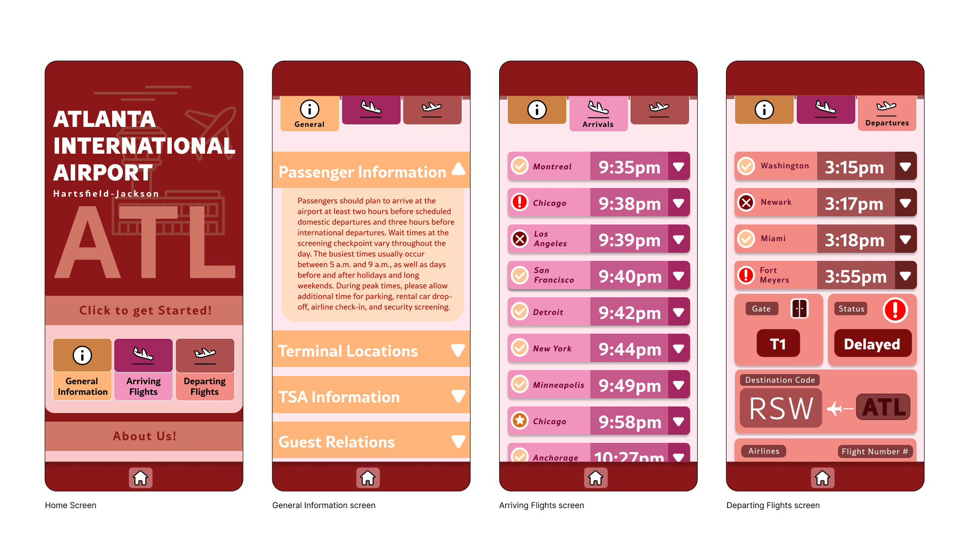
The final submission combines a warm, analogous color scheme into a user friendly, and approachable app, specifically designed to not overwhelm the user under stressful circumstances
Final Refinement
After taking personal experience with airports and flight information, after the submission, I realized the project needed reworking of color scheme, content format, and restructuring hierarchy to enhance clarity of the display.
The new color scheme which clearly differentiates and identifies groups of information.
Using less contrast between varying shades of each color enhanced clarity and reduced chaotic formats
Reorganized drop-down content efficiently communicates important information in order of relevancy