project objective:
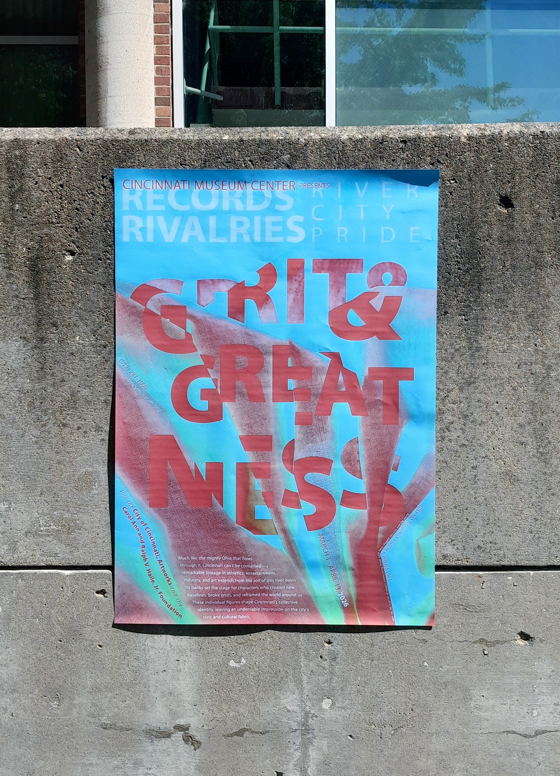
Communicating a visual theme/idea through typography and image, as well as establishing effective typographic hierarchy to quickly and efficiently communicate information within a 23.35" x 33" frame, from 30 feet, 10 feet, and 5 feet in distance.
The goal was to encourage viewers to attend an event at the Cincinnati Museum Center featuring achievements of the subject of the poster
Identifying a Subject
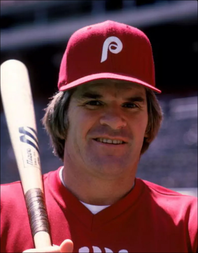
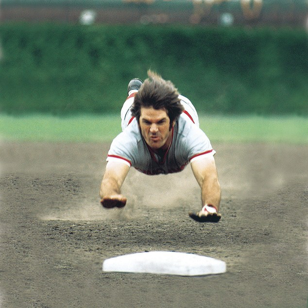
I created a poster based around Cincinnati baseball legend, Pete Rose. I wanted to try and communicate his impressive and ground-breaking career through the images and typography.

Hierarchy Studies
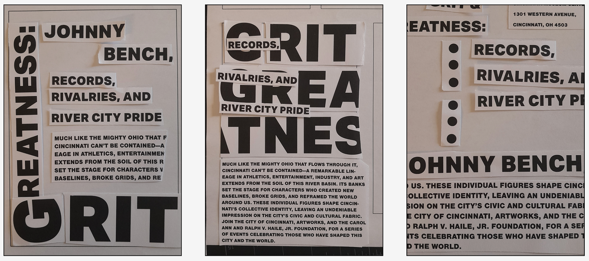
After identifying topics and subjects to base the poster around, we began by trying to experiment with different ways to effectively communicate 3 levels of typographic hierarchy: a "shout", a "talk" and a "whisper"
Real world textures
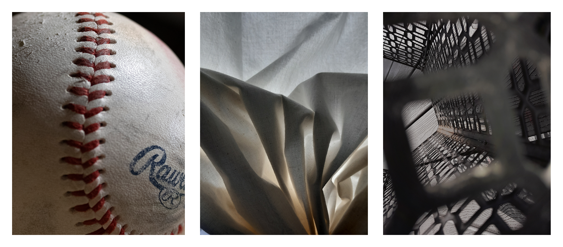
We did exploratory photo walks to try and use the spaces around us as ways to guide the creative directions of the posters
Digital Iterations
Layering the content on top of the images, and experimenting color and Adobe Photoshop blending modes, led to explorations of cutting type, distorting images, and type alignment and angles.


Post-Critique Iterations
After determining the strongest direction during critique, I went into Adobe Photoshop to further develop and experiment with color before adding determining the lay out of the content
TYPOGRAPHIC EXPERIMenTATION
When laying out the typographic content I used more traditional methods, as well as experimental, keeping legibility, the background image, readability, and color in mind


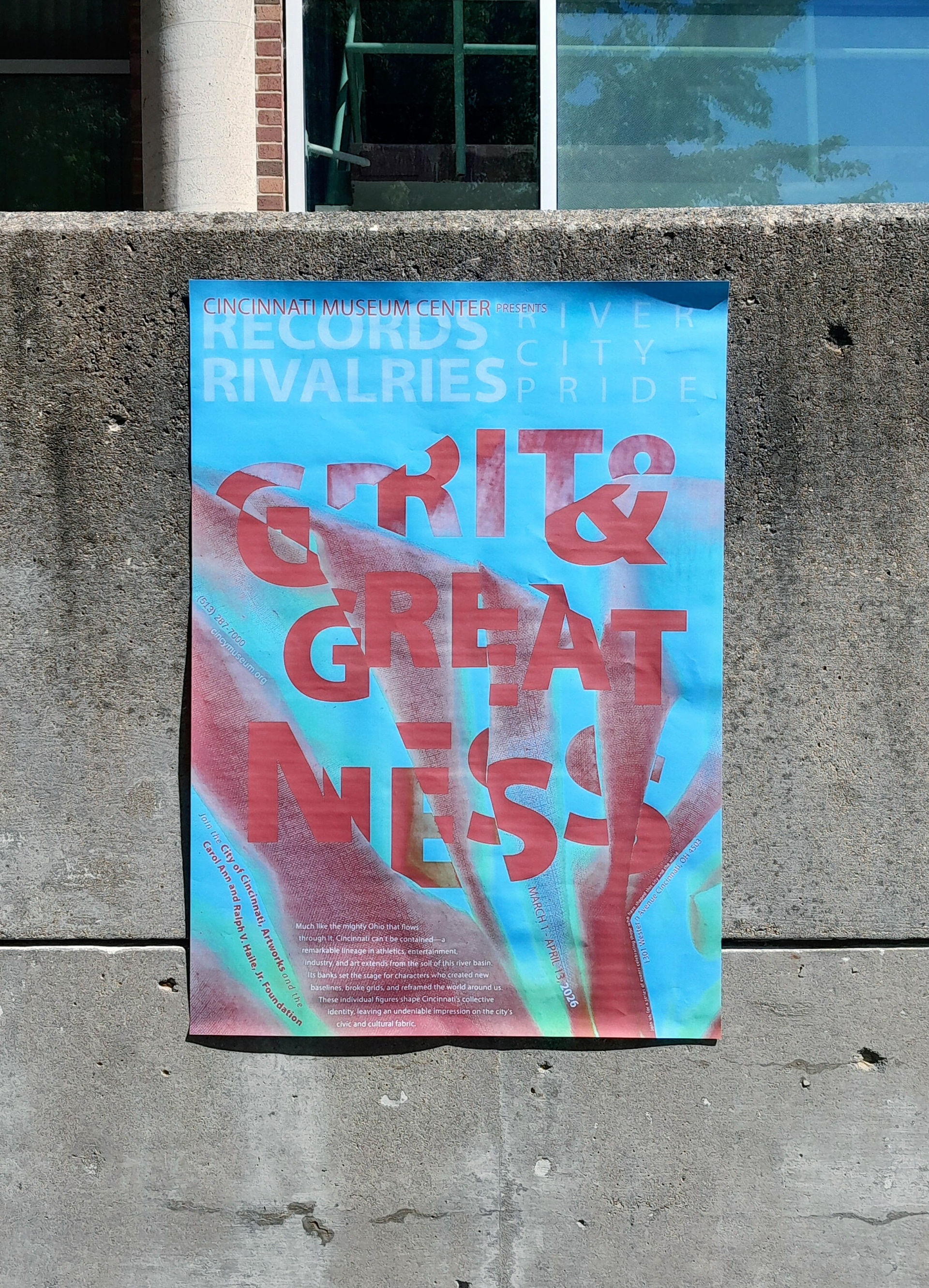
Final Poster Design
Made using both Adobe Illustrator and Adobe Photoshop, the final poster includes experimentation of typography as a visual element/image, typographic hierarchy, alignment of text in relation to the image, and color.